The color palette you choose for your trade show booth sends a powerful message about your company. Nearly 85% of consumers name color as the primary reason that they purchase a particular product. Choosing the right colors can significantly affect how consumers interact with your booth. Experts agree that you only have a limited time to grab a trade show attendee’s attention. Designing a compelling color scheme will give you the edge you need to stand out in the crowd.
Of course, it is a good idea to do some research before randomly settling on a color scheme. Here are a few things to keep in mind when choosing colors for your trade show booth:
Color Has Meaning.
The psychology of color in marketing directly plays into consumer behavior. Studies have shown that color can improve comprehension, learning, and reading significantly. Colors have different meanings, connotations, and emotional effects. In one study, Rose H. Alschuler and Berta Weiss Hattwick took drawings of children to determine color effects. They concluded that the blue color implied self-control and repression of emotions; the red color was an uninhibited expression; the yellow color indicated infantilism and dependence; and the green color showed balance, few emotional impulses, and simple nature.
Not only does color have meaning but the colors you choose can help create a certain mood in your booth. For example, warm colors like red and orange can create a sense of excitement, while cool colors like blue and green can create a sense of calm.
To learn more about the psychology of color download our printable poster.
Colors Evoke Different Emotions in Different Countries.
Color evokes emotional connections that are both cognitive and cultural. If you plan to set up a trade booth outside the US, it’s advisable to check if the colors you use hold a different meaning in that country. For example in America, the color green is associated with good luck, while in China, the color red is considered lucky.
To Stay on Brand or Not. That is The Question.
Like the famous phrase “to be or not to be”, staying on your brand colors is an important issue. For new products, you may want to choose other colors that stand out despite the fact that your brand may be different. However picking trade show display colors that don’t really match up with your brand, colors or message can wind up confusing potential customers and thus make your brand not as memorable. Keeping your brand color, and at the same time having new product line colors involves careful planning – see below for some helpful hints.
Consult a Media Design Expert.
Designers are trained in visual communications and color theory. Coming up with a color palette can be challenging. I recall an assignment from my college color theory class where the professor provided us with various PMS-colored papers to create an abstract piece of art. After our assignment, we reviewed everyone’s work by hanging the pictures side by side. The standout pieces were those that used a limited color palette of complimentary or similar colors, as opposed to those that utilized all or many of the available color choices. It was a valuable lesson to learn, for choosing a color palette. Other factors that contributed to the visual success of the piece were the shading and contrast of colors. But, that’s another lesson.
Bottom line, enlisting the services of a graphic designer can significantly improve the design of your trade show booth, especially if you lack an in-house design team.
Design Beyond your Display.
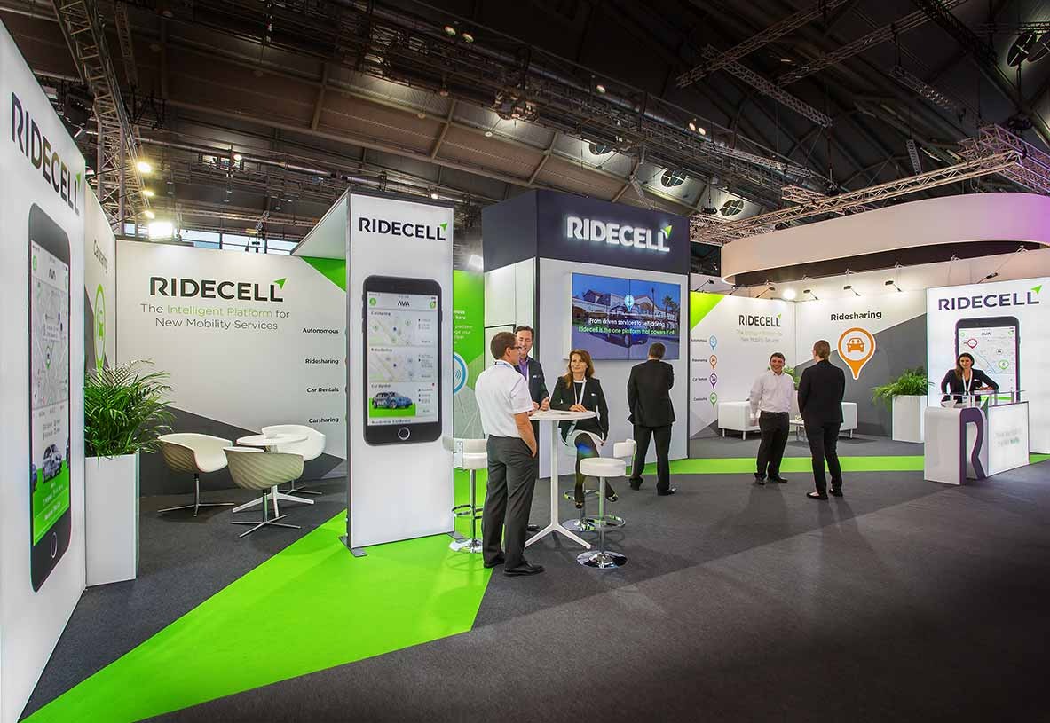
Once you’ve settled on a key color scheme, incorporate that color throughout and beyond your trade show display. Consider flooring, lighting design, counters, table covers, uniforms, floral decorations, and swag giveaway items. Color-coordinated uniforms that match the colors of your display can make you stand out in an attractive and memorable manner. Another benefit is that your staff can be recognizable to attendees when they are outside of the booth. The flooring can be another aspect of your color enhancement. And, don’t forget to use your color scheme in event-related promotions. Notably, on event landing pages, and advertisements.
Helpful Color Suggestions.
Color theory is a vast subject in itself, but if you are determined to do this yourself here are some valuable concepts about color. For the above dilemma about your branding color not being consistent with a new product line or you just need to make it stand out more. Consider using analogous colors. Analogous colors are colors with close harmonious relationships. A good example would be a forest landscape, combining green and yellow creates a rich color harmony.
Another design concept is to use complementary colors. Complementary colors are colors that are opposite. The old adage is true, opposites do attract. Since Complementary colors contrast, your display will pop out and have a great impact.
In Addition, use accent or bright colors to draw attention to key areas of your booth, such as your logo, product displays, or call to action.
Finding color schemes that match the color you are looking for is easy, there are several online color wheels to guide you, such as the Adobe color wheel website.
There are many other color elements you can play with, such as contrast, as mentioned with complementary colors, shades, and temperature. Using the shades of your logo could create a three-dimensional look in various areas of your display. The shade of a complementary color could enhance your floor or be put elsewhere to create a sense of movement in your booth. Creating a more friendly atmosphere may be the difference from just adding a warmer color. There are many factors involved and perhaps some good color theory books to read. The “Munsell: A Grammar of Color” and “Atlas of the Munsell color system” by Albert H. Munsell are both good.
Conclusion
The color scheme of your trade show display will determine how well your trade show display is received by attendees. Different colors evoke different emotions and reactions. By selecting the best colors to support your branding message, you can have an impact on how an attendee perceives your event. We’ve covered some useful ways color can be utilized. There is a lot more to the subject, but we hope that the points we’ve covered have built your understanding of how color can make a huge difference in the perception of a trade show display. By following these tips, you can use color to create a trade show booth that is both eye-catching and effective..