It’s launch day. Your sign is ready and you can’t wait to see it on the trade show floor. Then the worst case scenario happens – the design you worked so hard isn’t readable. You thought everything was big enough, but somehow your graphics just don’t have the same impact as they did on your comparatively tiny monitor.
What Makes a Sign Easy to Read?
The most important objective for your sign is to effectively communicate the benefits about your product or business. You can only achieve that objective if it’s easy to read. Over the years, expert newspaper editors, as well as advertisers (Ogilvy 1983, 90) have formulated many rules of thumb for readability that we have translated for use on display posters.
Simply put, your copy needs to be large enough to be read from a distance and brief enough that the average reader can absorb the message within the likely exposure time.
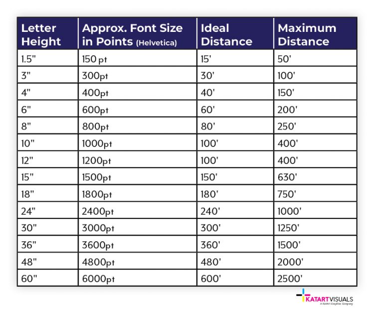
A good rule of thumb is that for every 10’ between your reader and your signage, add 1” to the height of your letters. A one inch tall character can easily be read by most people from a distance of 10’, but from 40’ away, you will need your type to be at least 4” tall for optimal readability.